Updated: 2010-04-30 00:44:31

NHS Halton and St Helens has produced several new InstantAtlas reports that reveal health needs at ward level (electoral ward) for two Local Authorities. This new resource will help health practitioners and commissioners to understand the health needs of their local populations. The reports are based on a number of different health statistics. These can [...]
Updated: 2010-04-29 16:43:12
There is no way to think up an original and extraordinary design—it can only come as a result of pursuing a given task. In the same way running down a list of words is different from making a narrative.
Artemy Lebedev, Designer’s block, February 16, 2010
This applies to visualization too. When you don't have a question [...]
Updated: 2010-04-28 20:54:41

Nike Basketball partnered up with the good folks from Stamen to create a new visualization for the NBA Playoffs. Post-season Twitter Playoffs compares the competing teams based on how many times their name is mentioned in the Twittersphere.
Updated: 2010-04-28 06:14:24
Infochimps, the open marketplace for data, just released their updated Twitter Census dataset with over 1.6Billion Tweets. The data consists of various subsets for you to grab and play with.
Updated: 2010-04-26 09:23:48
“Beautiful Visualization – Looking at data through the eyes of experts” is out (at least the ebook edition). I am proud to be among the authors, along with giants like Aaron Koblin, Fernanda Viega and Martin Wattenberg, Jer Thorp or Jessica Hagy. I mostly flipped through the book up to now, but from what I [...]
Updated: 2010-04-26 06:25:14

Recently I've spotted a beautifully designed study of The Four Seasons by Antonio Vivaldi. It's the work by Laia Clos' studio mot.
Updated: 2010-04-26 01:30:00

Support Analytics Consulting Subscribe to main feed Enter your email to get the main feed in your inbox Support Analytics Blog Home Blog Subscribe Bookstore About Advertise e-Store Links Most Overused Data Visualization Term Acquisition Speculation Chart The image below appeared in the redesigned issue of BusinessWeek after Bloomberg acquired the magazine . 160 I will honestly say that I studied it for a few minutes and read the text a few times before I really understood what the data was showing . 160 I think the psychedelic layout of the bubbles adds a confusing element to the visualization that is unnecessary . 160 There are a bunch of different ways to show this data that would be more straight forward and easier for the readers to . understand source Do you think the visualization
Updated: 2010-04-23 18:36:48
Here are just some of the latest IA6 reports published by InstantAtlas customers
Updated: 2010-04-21 20:15:33

The Afghan Conflict - A Map of Possible Scenarios is the collaboration work of Pierre la Baume, Karen Hentschel and Marc Tiedemann. It was initiated by the lecture Politikvisualisierung in winter 2009/2010 at the Fachhochschule Potsdam.
Updated: 2010-04-19 05:00:48

FORM+CODE is a new book about computational aesthetics to be published by in fall 2010. It is written by Casey Reas, Chandler McWilliams and LUST and the list of featured artists reads like the who-is-who of the generative design community.
Updated: 2010-04-17 08:00:11
You did not make it to this years SEE Conference in Wiesbaden? No need to worry: while we enjoy the presentations from Nicholas Felton, Kent Demain, Andrew Vande Moere and others, we are busy documenting what's happening live via Twitter and you get instant updates here on Datavisualization.ch.
Updated: 2010-04-16 19:15:47
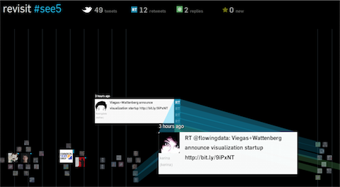
Just a quick post to let you know that I put a new project online: revisit – a real–time visualization of the last few hundred tweets around a topic. In contrast to the usual twitter walls, it try to capture some of the temporal dynamics as well as the conversational aspects of twitter. Scroll down [...]
Updated: 2010-04-16 15:59:32

InstantAtlas Bulletin Edition | Focus on UK Local Government and International Public Health with reports from Yorkshire Futures, Nottingham City Council, Louisiana Department of Health and LIGA in Germany
Updated: 2010-04-16 05:00:02
Join the good folks from Datavisualization.ch at SEE#5 for a chat & cold beer! We hope to finally meet some of our readers finally in person.
Updated: 2010-04-14 05:00:04
Sunlight Labs, a part of the Sunlight Foundation, recently announced their "Design for America" competition. It aims to connect the talents of art and design communities to the wealth of government data and to help nurture the field of information visualization.
Updated: 2010-04-13 09:34:39
Together with Kim Rees from Periscopic I have reviewed the social data visualization application Swivel. Swivel is a simple to use web application that lets you visualize public or private data sets and collaborate openly or in closed user groups.
Updated: 2010-04-12 07:46:44

The New York Times has been busy publishing their news vocabulary as linked open data since 2009. Now, Evan Sandhaus has published a short but thorough tutorial about building an application that's based on this data.
Updated: 2010-04-11 17:04:52
: , Latest News About Contact Other Reading Search Stories : Web Analytics Optimization April 11th , 2010 by Lars Johansson I made a video to inspire businesses to achieve more . Enjoy Other Posts Automated Suggestions Interview with Danny Sullivan of Calafia Consulting and Search Engine Land IMC Vancouver 2008 Recap Web Analytics , Testing , Marketing , and more Stay Hungry . Stay Foolish . 8221 Omniture Prefers Visual Sciences , WebTrends Executives Leave WebTrends Never Wanted to Be Gobbled up by The Big Green Omnivore Share the : love Close Bookmark and Share This Page Save to Browser Favorites Bookmarks Ask backflip blinklist BlogBookmark Bloglines BlogMarks Blogsvine BuddyMarks BUMPzee CiteULike co.mments Connotea del.icio.us Digg diigo DotNetKicks DropJack dzone Facebook Fark Faves
Updated: 2010-04-07 19:01:12
, Latest News About Contact Other Reading Measuring Online Content Using Google Analytics April 7th , 2010 by Lars Johansson I’ve written an article about measuring online content for the latest issue of Website Magazine A : teaser Many editors feel that once content has been created and uploaded , their job is done . That’s not true . If you don’t measure , you can’t analyze . If you don’t analyze , you can’t improve . And the easiest way to analyze is by implementing Google Analytics . It’s free , so there is no excuse not to use it . And , yes , it works for intranets , too . Using Web analytics , you can measure the effectiveness of content . It is possible to measure how well the content is performing even for purely informational websites , including intranets , that are not